
Open Block Scope Block | PROD | Top
Waiting for JS…
In fringilla risus non eget pellentesque arcu

Blog
Blog
Blog
Rich Text H3 Wide Heading
Faucibus aliquam dapibus pellentesque lacinia posuere nec. Duis viverra cras at a in mattis dolor eget lacus. Orci interdum phasellus amet ipsum neque. Enim feugiat in egestas neque leo lacus pulvinar. Vitae tortor eleifend aliquam dictum mattis porttitor odio. Pharetra posuere velit neque purus tempus turpis nulla odio. Pharetra turpis adipiscing gravida semper amet. Venenatis vitae eget pellentesque fermentum sit egestas mauris habitant.
Arcu sed sodales nulla sem tristique in lectus lacus ultrices et ornare.
Faucibus aliquam dapibus pellentesque lacinia posuere nec. Duis viverra cras at a in mattis dolor eget lacus. Orci interdum phasellus amet ipsum neque. Enim feugiat in egestas neque leo lacus pulvinar. Vitae tortor eleifend aliquam dictum mattis porttitor odio. Pharetra posuere velit neque purus tempus turpis nulla odio. Pharetra turpis adipiscing gravida semper amet. Venenatis vitae eget pellentesque fermentum sit egestas mauris habitant. In pulvinar odio sed purus. Ut bibendum risus viverra gravida pellentesque ultrices. Duis cras amet suspendisse libero velit aenean scelerisque lectus. Vel orci mattis quis duis facilisis in mi viverra arcu. Metus sagittis augue pellentesque dictum vitae consectetur.
Facilisis id in maecenas justo rutrum amet. Cursus leo pulvinar pellentesque sed. Auctor mauris sapien lectus purus eget nunc blandit eget. Vulputate eget mattis mi morbi congue viverra. Faucibus faucibus amet eros nunc urna. Id arcu eget venenatis quisque commodo aliquam diam. Turpis tristique est mattis vivamus sagittis lacus donec. Bibendum massa egestas vel cras ac accumsan. Lorem felis pellentesque neque rutrum.
H3 | Arcu sed sodales nulla sem tristique in lectus lacus ultrices et ornare.
Faucibus aliquam dapibus pellentesque lacinia posuere nec. Duis viverra cras at a in mattis dolor eget lacus. Orci interdum phasellus amet ipsum neque. Enim feugiat in egestas neque leo lacus pulvinar. Vitae tortor eleifend aliquam dictum mattis porttitor odio. Pharetra posuere velit neque purus tempus turpis nulla odio. Pharetra turpis adipiscing gravida semper amet. Venenatis vitae eget pellentesque fermentum sit egestas mauris habitant. In pulvinar odio sed purus. Ut bibendum risus viverra gravida pellentesque ultrices. Duis cras amet suspendisse libero velit aenean scelerisque lectus. Vel orci mattis quis duis facilisis in mi viverra arcu. Metus sagittis augue pellentesque dictum vitae consectetur.
Facilisis id in maecenas justo rutrum amet. Cursus leo pulvinar pellentesque sed. Auctor mauris sapien lectus purus eget nunc blandit eget. Vulputate eget mattis mi morbi congue viverra. Faucibus faucibus amet eros nunc urna. Id arcu eget venenatis quisque commodo aliquam diam. Turpis tristique est mattis vivamus sagittis lacus donec. Bibendum massa egestas vel cras ac accumsan. Lorem felis pellentesque neque rutrum.
Arcu sed sodales nulla sem tristique in lectus lacus ultrices et ornare.
Faucibus aliquam dapibus pellentesque lacinia posuere nec. Duis viverra cras at a in mattis dolor eget lacus. Orci interdum phasellus amet ipsum neque. Enim feugiat in egestas neque leo lacus pulvinar. Vitae tortor eleifend aliquam dictum mattis porttitor odio. Pharetra posuere velit neque purus tempus turpis nulla odio. Pharetra turpis adipiscing gravida semper amet. Venenatis vitae eget pellentesque fermentum sit egestas mauris habitant. In pulvinar odio sed purus. Ut bibendum risus viverra gravida pellentesque ultrices. Duis cras amet suspendisse libero velit aenean scelerisque lectus. Vel orci mattis quis duis facilisis in mi viverra arcu. Metus sagittis augue pellentesque dictum vitae consectetur.
Facilisis id in maecenas justo rutrum amet. Cursus leo pulvinar pellentesque sed. Auctor mauris sapien lectus purus eget nunc blandit eget. Vulputate eget mattis mi morbi congue viverra. Faucibus faucibus amet eros nunc urna. Id arcu eget venenatis quisque commodo aliquam diam. Turpis tristique est mattis vivamus sagittis lacus donec. Bibendum massa egestas vel cras ac accumsan. Lorem felis pellentesque neque rutrum.
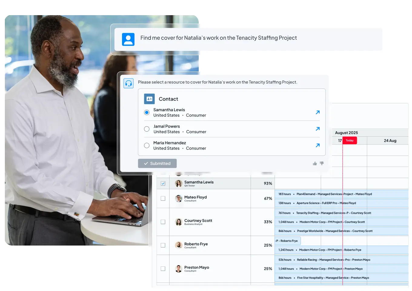
Flexible hero layout with a tab-driven image carousel on the right
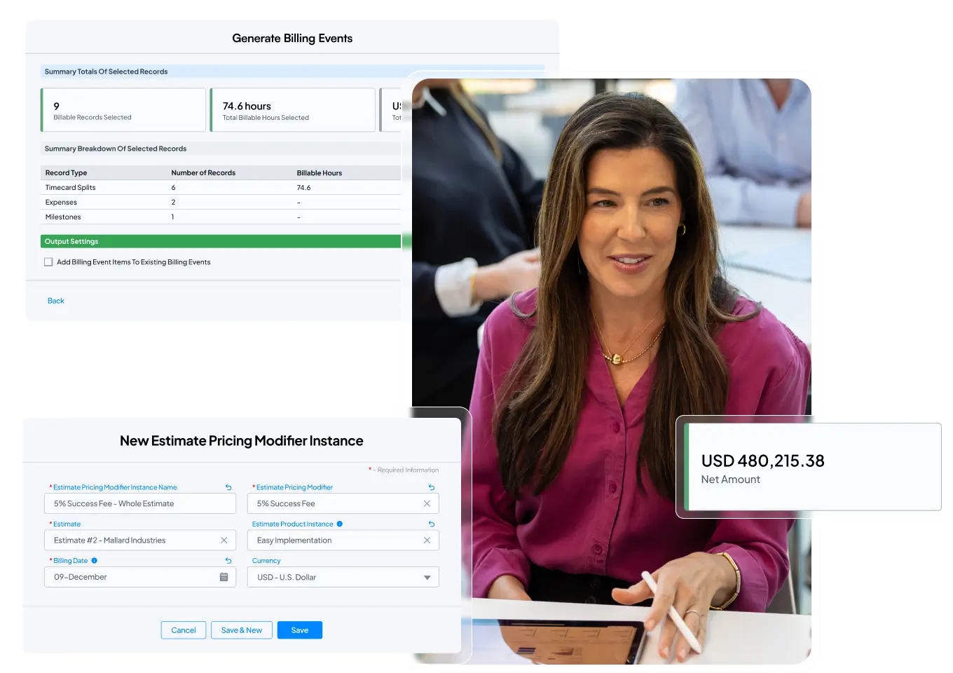
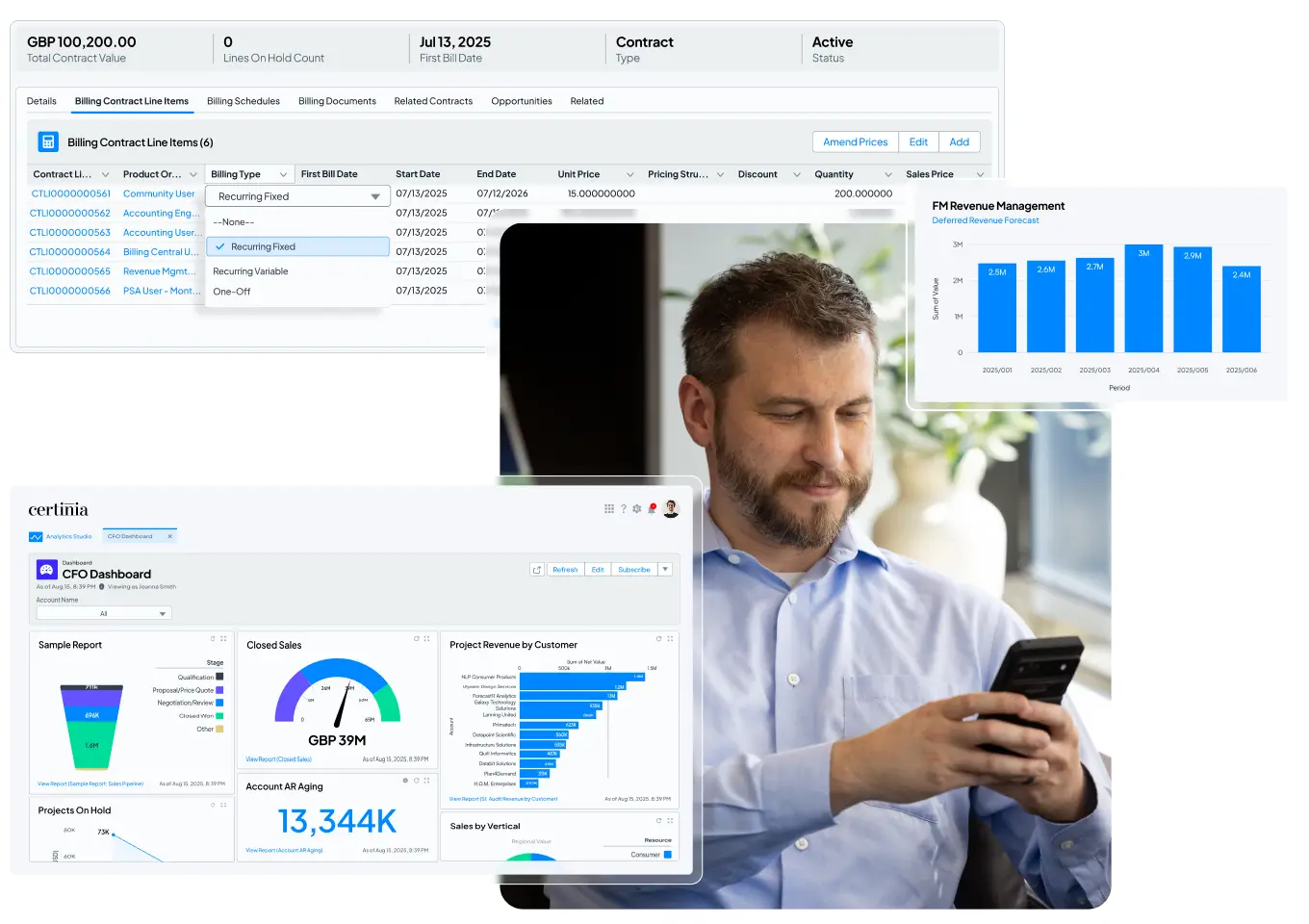


Flexible hero layout with a single static image on the right
Hero layout with a full-width background image

Simple hero layout with centered title and subtitle
Card block variation with icons and optional list items
Flexible card with icon and text
- Item one goes here
- Item two goes here
- Linked item goes here
Configurable text and optional list items
- Item one goes here
- Item two goes here
- Linked item goes here
Supports icons, descriptions, and linked items
- Item one goes here
- Item two goes here
- Linked item goes here
Eight-card layout with icons, titles, and descriptions
Cards with optional images and full-card link support


CTA layout with tabbed text and media
Interactive video CTA
Alternate image variation
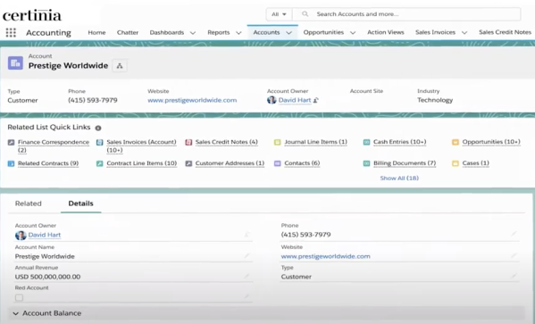
Image variation two
Image variation Three
CTA with Icon Block
Clear and simple headline
Key benefit or feature
Secondary highlight
Additional point
Scrolling logos block


Testimonial Carousel Block
This block displays customer testimonials in a horizontal carousel. Each slide includes a logo, quote, name, and role. Users can navigate between slides using arrow controls. An alternate variation includes a logo-based progress bar below the carousel, allowing users to jump directly to a specific testimonial.
Rotating testimonials with logos and navigation controls


Rotating testimonials with logos and navigation controls and progress bar


Recent Articles or Featured Resources


Footer CTA with Static Image
Main call-to-action headline that captures attention
Footer CTA with Multiple Static Images
Static Image + Left-Aligned Content

Static Image + Right-Aligned Content
-
This is a checkbox item.
-
These items are rich text fields so you have more control of text
Embedded Video + Left-Aligned Content
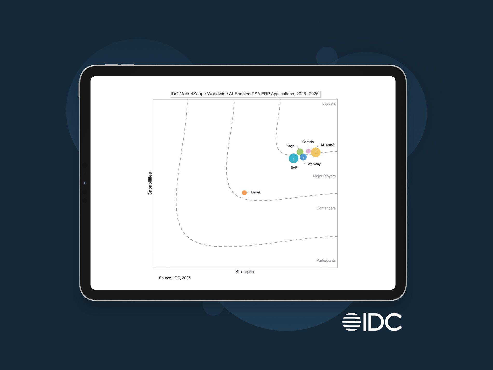
Certinia named a Leader in IDC MarketScape AI-enabled PSA ERP Applications
Discover why uniting financial management and services delivery is so critical to your services business success. With Certinia, you get strengths in:
- Visibility and AI enablement
- Built for the future
- Product road map
Citation: IDC MarketScape: Worldwide AI-Enabled PSA ERP Applications 2025-2026 Vendor Assessment, #US50655323, November 2025
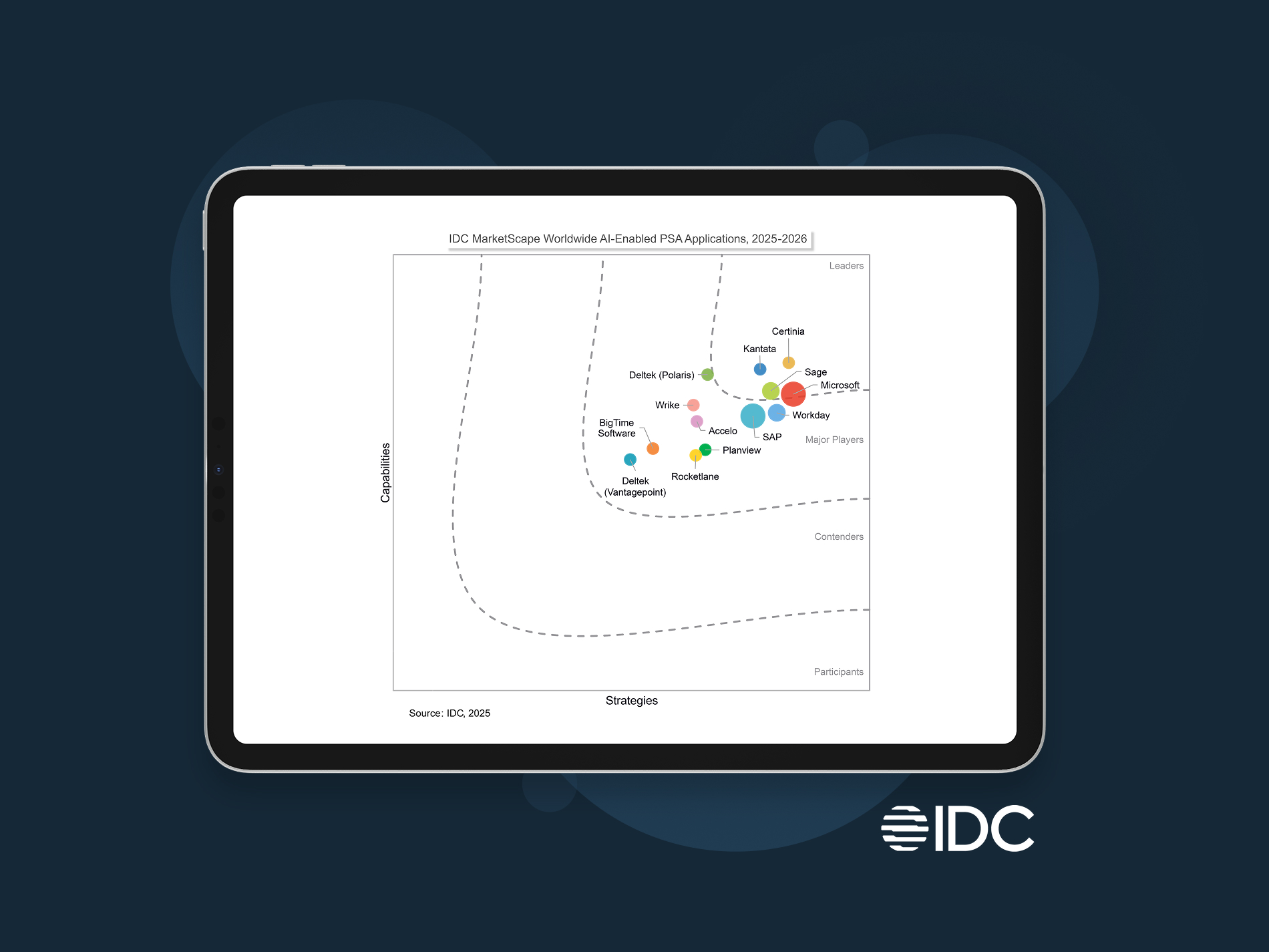
Certinia Named a Leader in IDC MarketScape for Worldwide AI-Enabled PSA
Streamline projects, optimize resources, and boost profit margins. That’s Certinia AI-powered PSA.
- Visibility and AI enablement
- Built for the future
- Product road map
Citation: IDC MarketScape: Worldwide AI-Enabled PSA Applications 2025-2026 Vendor Assessment, #US50655623, December 2025
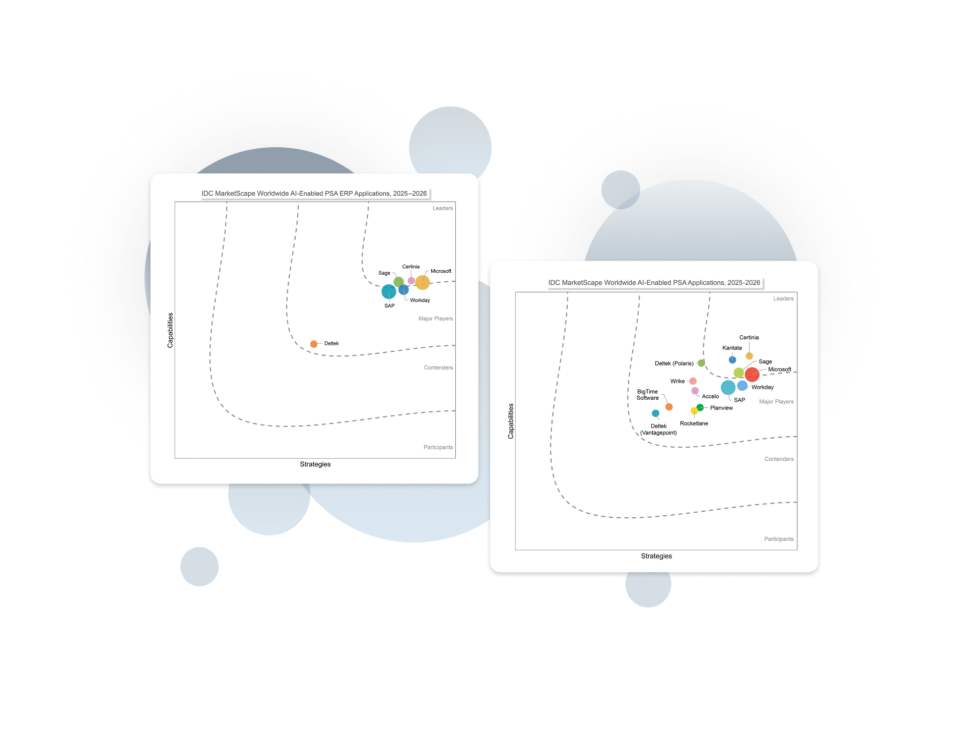
Certinia named a Leader in two IDC MarketScapes for AI-enabled PSA and PSA ERP
Built for the future. Get the actionable AI, working AI Agents, and vast visibility you need to execute with confidence and outpace competition.
Read PSA Excerpt Read PSA + ERP Excerpt
Citation: IDC MarketScape: Worldwide AI-Enabled PSA Applications 2025-2026 Vendor Assessment, #US50655623, December 2025 and IDC MarketScape: Worldwide AI-Enabled PSA ERP Applications 2025-2026 Vendor Assessment, #US50655323, November 2025
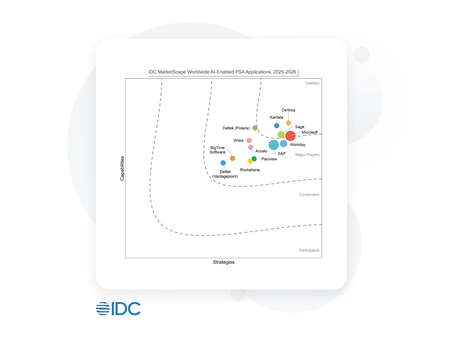
Certinia Named a Leader in IDC MarketScape for Worldwide AI-Enabled PSA
Streamline projects, optimize resources, and boost profit margins. That’s Certinia AI-powered PSA.
 |
Visibility and AI enablement |
|
Built for the future |
|
Product road map |
Citation: IDC MarketScape: Worldwide AI-Enabled PSA Applications 2025-2026 Vendor Assessment, #US50655623, December 2025
Enterprise AI you can trust
Certinia embeds AI directly into the workflows that run your services business — helping teams plan smarter, act faster, and stay focused on high-value work.
Because Certinia is built natively on Salesforce, the Certinia AI operates on a single, trusted source of data, ensuring every insight is accurate, secure, and actionable.
Meet the new standard for AI-powered services delivery: connected, intelligent, profitable.


See what AI-powered services delivery looks like
What if your teams could plan, deliver, and grow on one intelligent platform?
Schedule a free demo and see how Certinia brings AI and embedded agents into every stage of the services journey—from opportunity to renewal.
Empowering 1,400+ customers

- Senior Vice President, Global Customer Outcomes
- Siemens

- Senior Director, Professional Services
- Avalara

- Worldwide Director of Service Delivery
- Thales

- Senior Director of Operations
- Salesforce
- Director, Global Business Operations
- BigID

- SVP, Professional Services
- Diabsolut

- Solution Architect
- Icon Cloud Consulting
Accordion Left Underlined | Section Title
This is a rich text area on the Accordion block. Lorem ipsum dolor sit amet, consectetur adipiscing elit. Aenean ornare maximus felis, vel tristique mauris. Mauris tellus nisl, finibus non augue at, gravida vehicula dolor. Suspendisse potenti. Integer sed eleifend arcu. Suspendisse posuere feugiat viverra. Maecenas bibendum semper mauris, at sollicitudin sem imperdiet ut. Aenean semper lorem ac lectus semper luctus. Morbi eu felis aliquet, egestas sapien eget, pulvinar ipsum. Duis laoreet faucibus libero, ac tristique sapien lacinia sit amet. Integer tempor ut eros eget ultrices. Mauris posuere rhoncus metus, nec tincidunt mauris pellentesque vitae. Maecenas a auctor lorem, nec mollis risus. Maecenas tempus dui dolor. Nunc sit amet maximus felis. Proin viverra metus eget libero congue, non dictum dolor sollicitudin.
Accordion Full Width Title
Accordion Full Width Title
Accordion Left | Content Right | Underlined & Image

Accordion Right | Left Content Title
H2 | Content Title
This is a rich text area on the Accordion block. Lorem ipsum dolor sit amet, consectetur adipiscing elit. Aenean ornare maximus felis, vel tristique mauris. Mauris tellus nisl, finibus non augue at, gravida vehicula dolor. Suspendisse potenti. Integer sed eleifend arcu. Suspendisse posuere feugiat viverra. Maecenas bibendum semper mauris, at sollicitudin sem imperdiet ut. Aenean semper lorem ac lectus semper luctus. Morbi eu felis aliquet, egestas sapien eget, pulvinar ipsum.
Accordion Right | Left Content | Title & Image
About Title
Accordion Company Block with a Company Logo and Profile Details
About Description | RTE
Description | RTE | H2
CTA Text with Media Defaults description: (Media Alignment=Left Aligned, Wide=Unchecked, Image Object Spacing=Center, Background=Neutral 0, Text=Dark, Block Padding=40px)

Description | RTE | H2
CTA Text with Media Defaults description: (Media Alignment=Right Aligned, Wide=Checked, Image Object Spacing=Center, Background=Neutral 0, Text=Dark, Block Padding=40px)

Customer Stories Block
The Customer Success Stories Block uses properties (Type Label, Search Title, Excerpt, and Image) from the Search tab of the Customer Success Stories Page as the card text. If no customer success stories pages are added, the latest three are pulled in automatically. On click, users are directed to the corresponding Customer Success Stories page.
Customer Success Stories | Gradient Blue | Light Text


11 reasons to run your financials on Salesforce
Salesforce CRM allows businesses to store and manage customer information, automate daily administrative tasks, and supercharge their reporting.

Image Right Aligned, CLIPPED. Sky Blue to Ice Background color. Body Large Text

11 reasons to run your financials on Salesforce
Salesforce CRM allows businesses to store and manage customer information, automate daily administrative tasks, and supercharge their reporting.

Image Left Aligned, CLIPPED. Sky Blue to Ice Background color. Body Large Text
Floating Content Block
The Floating Content Block allows editors to create a promotional message with a call-to-action (CTA) that can display either as a banner fixed to the top of the page or as a floating element in the lower-left corner of the page. The block can be added sitewide through the Home Page's Floating Content tab or applied to individual pages for targeted messaging.
Form CTA Block
This block allows the content editor to add an iFrame Form type. If a site visitor tries to submit the form without the required properties, the scroll bars are displayed.
Master the Art of Connected Resource Management
What you’ll learn
-
Strategic Insight: How to move from reactive to proactive forecasting.
-
Efficiency Gains: Best practices for eliminating manual billing and revenue recognition errors.
-
Case Proof: A look at how leaders in [Target Industry] are automating their entire lead-to-ledger motion.
-
Scalability: Frameworks for maintaining project quality while scaling global teams


Full Image + Text Card | Text Overlayed | Neutral 0 | Dark Text
Full Image + Text Card | Text Overlayed | Radial Blue | Light Text

Full Image + Text Card Overlay (Image Link Card)


Full Image + Text Card | Text Below Image
H2 | All float styles in one block to illustrate the differences
H3 | Rich Text Block with: In Content CTA block | Image | None

In Content CTA | Image | Float None
Customer Success was supposed to be the growth engine of the subscription economy. Instead, in many organizations, it has become the function most accountable for revenue outcomes — and the least able to control the conditions that determine them.
Executives want predictable growth. Boards want retention. Security teams want reduced risk. Finance wants proof of value. And Customer Success is expected to deliver all of it while often operating across systems it doesn’t own and processes it can’t fully enforce.
The issue isn’t a lack of expertise. Most CS leaders know what healthy customer relationships look like. The challenge is sustaining that health when the customer story is scattered across departments, tools, and reporting structures.
H3 | Rich Text Block with: In Content CTA block | Image | Left
Image | Float Left
When organizations investigate churn, they often search for a specific cause — a sale rushed through at the end of the quarter, a failed implementation, a support breakdown, a pricing dispute. But revenue loss rarely starts with one event. More often, it accumulates gradually as context erodes across internal handoffs.
Sales closes a deal based on assumptions that aren’t well documented and never fully translate into delivery planning. Implementation teams adapt as conditions change, but lack a consistent way to communicate those changes downstream. By the time a Customer Success Manager prepares for renewal, the official account narrative no longer reflects reality. No single team failed. Yet the outcome is in doubt.
This is why many renewals that once looked secure (and enjoyed a “green” health score) suddenly become tense conversations. Warning signs existed, but they were distributed across systems and timelines, never forming a complete picture early enough for proactive action.
Rich Text Block with: In Content CTA block | Image | Right
Over the past decade, companies have invested heavily in technology to manage the customer lifecycle. Each solution improves visibility into a specific domain. Together, they promise comprehensive insight. In practice, they often create fragmentation.
Customer information moves between platforms on different schedules. Metrics are calculated using slightly different definitions. Updates occur in parallel but not in sync. When scope shifts, adoption stalls, or commercial terms change, there is rarely a single system that reflects the full impact in real time.

Image | Float Right
Even advanced analytics struggle here. AI can identify patterns, but it cannot compensate for missing or contradictory inputs. Automation can accelerate workflows, but it cannot determine which version of the truth should guide decisions.
So teams default to what feels reliable: meetings, manual updates, and spreadsheets that attempt to reconcile competing data sources. This puts customer success leaders in a huge bind, and brings the bullseye squarely onto their chest.
This version of the Information block uses the Neutral Color Theme and the Circle with Question Mark icon.
This is a test info block with Red and the Triangle with Warning Sign icon selected.
This version of the Information block was set to Green with the Circle with Warning Sign icon.
This is a test info block with Blue selected. The selected icon is Circle with Question Mark.
Inline Resource Block
The Inline Resource Block allows content editors to create a visually distinct callout within page content by combining an image, text, and a link with a customizable background color. Designed to break up text-heavy pages, the block helps draw attention to related resources, key information, or calls to action.


Layout Block
The Layout block allows the content editor to add a Featured Content block and apply a variety of layout options: One-Third and Two-Thirds, Two-Thirds and One-Third, or half-half. This block provides flexibility in presenting featured content while creating visual variety and hierarchy within a page.
11 reasons to run your financials on Salesforce
Salesforce CRM allows businesses to store and manage customer information, automate daily administrative tasks, and supercharge their reporting.
11 reasons to run your financials on Salesforce
Salesforce CRM allows businesses to store and manage customer information, automate daily administrative tasks, and supercharge their reporting.
Image Left Aligned, CLIPPED. Sky Blue to Ice Background color. Body Large Text
Image Right Aligned, CLIPPED. Sky Blue to Ice Background color. Body Large Text
11 reasons to run your financials on Salesforce
Salesforce CRM allows businesses to store and manage customer information, automate daily administrative tasks, and supercharge their reporting.
Image Right Aligned, CLIPPED. Sky Blue to Ice Background color. Body Large Text
Empowering 1,400+ customers


Masonry Block
The Masonry Block allows content editors to create a visually engaging collection of masonry-style tiles. Each masonry item can include a title, link, background image, and an optional foreground image with configurable alignment. The block is designed to showcase featured content and resources in a dynamic, visually varied layout that draws attention and encourages engagement.
Foreground image (center-aligned) and a link.

Background image, foreground image (right-aligned), and a link.

Background image, foreground image (left-aligned), and a link.

Background image, foreground image (center-aligned), without a link.

Background image, foreground image (center-aligned), without a link.
Metrics Block
The Metrics Block allows content editors to highlight key statistics, achievements, or performance indicators in a visually engaging format. Editors can configure a section heading, customize the appearance of the metric cards, and display up to three individual metrics.
When animation is enabled, metric values count up from zero as they scroll into view, helping draw attention to important statistics. The animation triggers once per browser session to provide an engaging experience without becoming distracting on subsequent visits.
Metrics Block - Linear
Background Color = Blue 25, Dark Text
Metrics Block - Linear 40 (small)
Background Color = Gradient Blue, Light Text
Metrics Block - Ease Out (Cubic)
Background Color = Neutral 1000, Light Text.
Open Block
The open block is intended to support rapid validation through Optimizely experiments, allowing performance data to determine whether a concept should be promoted into a formal block for global reuse. The block includes HTML, CSS, and JavaScript areas, along with an Experiment Key, and a check-box to Lazy-Load the JS.
Open Block Scope Test | PROD | Bottom
Waiting for JS…
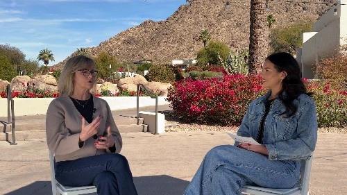
Insights interview with Raju
With Certinia Order & Inventory Management, you can simplify, optimize, and leverage inventory data at every stage of the fulfillment process. Get flexible pricing structures, views into upsell opportunities, available inventory, and margins at the line level.
Recent News Block
The Recent Coverage Block automatically displays the five most recent items from the Recent Coverage page in descending date order. Each item includes the Link Title, Publication Date, and Company/Source, providing visitors with quick access to the latest media mentions and coverage. The block automatically keeps content current by displaying the latest published coverage items without requiring manual updates.
In the News
Recent News | Automatically pulls in Articles from the Recent Coverage page.
Watch the latest
See All
Insights interview
Details about what the user will see/learn in the video
Watch Now | Link to YouTube Video
ROI Calculator Block
The ROI Calculator Block estimates the annual financial impact of improved utilization and project management productivity for professional services organizations. Users can toggle between two perspectives:
Growth Mode: Focuses on revenue gains from improved billable utilization
Margin Mode: Focuses on cost savings and margin improvement
Professional Services Cloud ROI Calculator
What could the impact of a Professional Services Cloud platform look like for your business? Use the calculator below to find out.
Disclaimer: For illustrative purposes only. These are estimates and are not guarantees of anticipated specific future benefits.
Consectetur adipiscing elit ornare ligula feugiat, pellentesque mauris vitae.
With one connected system, your numbers stay aligned to delivery—so you can move faster, reduce leakage, and forecast with confidence.
Render Natural Size
Render Natural Size
Lorem ipsum dolor sit amet, consectetur adipiscing elit. Sed ornare ligula feugiat, pellentesque mauris vitae, congue velit.
Render Natural Size
Lorem ipsum dolor sit amet, consectetur adipiscing elit. Sed ornare ligula feugiat, pellentesque mauris vitae, congue velit.
Lorem ipsum dolor sit amet
Default Settings
Lorem ipsum dolor sit amet, consectetur adipiscing elit. Sed ornare ligula feugiat, pellentesque mauris vitae, congue velit.
Lorem ipsum dolor sit amet
Default Settings
Lorem ipsum dolor sit amet, consectetur adipiscing elit. Sed ornare ligula feugiat, pellentesque mauris vitae, congue velit.
Lorem ipsum dolor sit amet
Render Natural and Hide Image Shadow
Lorem ipsum dolor sit amet, consectetur adipiscing elit. Sed ornare ligula feugiat, pellentesque mauris vitae, congue velit.
Lorem ipsum dolor sit amet
Object Cover (default) and Hide Image Shadow
Lorem ipsum dolor sit amet, consectetur adipiscing elit. Sed ornare ligula feugiat, pellentesque mauris vitae, congue velit.
A title should appear

- Job title
- Company
Avalara
- Job title
- Company
- Job title
- Company
Scrolling Quote Title (Plain Text Area - String)


Scrolling Image Block
The Scrolling Image Block allows content editors to create an interactive, scroll-driven experience that combines text, imagery, and animation. The block includes a title, subtitle, and a collection of scrolling image items that are displayed as users navigate through the content.
This block is ideal for storytelling, process explanations, feature highlights, or showcasing content in a visually engaging and sequential format.
Scrolling Image Block | Title Property
With one connected system, your numbers stay aligned to delivery—so you can move faster, reduce leakage, and forecast with confidence.
Render Natural Size
Render Natural Size
Lorem ipsum dolor sit amet, consectetur adipiscing elit. Sed ornare ligula feugiat, pellentesque mauris vitae, congue velit.
Render Natural Size
Lorem ipsum dolor sit amet, consectetur adipiscing elit. Sed ornare ligula feugiat, pellentesque mauris vitae, congue velit.
Lorem ipsum dolor sit amet
Default Settings
Lorem ipsum dolor sit amet, consectetur adipiscing elit. Sed ornare ligula feugiat, pellentesque mauris vitae, congue velit.
Lorem ipsum dolor sit amet
Default Settings
Lorem ipsum dolor sit amet, consectetur adipiscing elit. Sed ornare ligula feugiat, pellentesque mauris vitae, congue velit.
Lorem ipsum dolor sit amet
Render Natural and Hide Image Shadow
Lorem ipsum dolor sit amet, consectetur adipiscing elit. Sed ornare ligula feugiat, pellentesque mauris vitae, congue velit.
Lorem ipsum dolor sit amet
Object Cover (default) and Hide Image Shadow
Lorem ipsum dolor sit amet, consectetur adipiscing elit. Sed ornare ligula feugiat, pellentesque mauris vitae, congue velit.
Scrolling Quote Block
The Scrolling Quote Block allows content editors to create a rotating collection of testimonials, customer stories, or featured quotes. Editors can add a title, description, and a series of testimonial slides, each containing customizable content and styling options.
This block is ideal for showcasing customer testimonials, partner highlights, success stories, and endorsements in an engaging, visually rich carousel format.
Scrolling Quote Block


Scrolling Quotes w Logo Nav
Scrolling Resources Block
The Scrolling Resources Block allows content editors to display a collection of resource cards in either a slider or grid layout, providing flexibility in how content is presented to site visitors.
Editors can choose between a scrollable carousel experience or a static grid display, making the block ideal for showcasing related resources, services, featured content, or calls to action in a visually engaging and organized format.
Scrolling Resources | Disable Slider


Unlinked Image Resource Type

When a user hovers over the image, the image expands slightly to generate interest.
Speaker Bios Block
The Speaker Bios Block allows content editors to showcase speakers, presenters, authors, or featured individuals in a responsive card-based layout. Editors can add one or more speaker cards, each containing biographical information, company details, and optional links to external profiles.
This block is designed to highlight speakers, authors, presenters, executives, and other featured individuals in a visually engaging and accessible format.
Speaker Bios | 3 Speakers

Yvette Ross


Monica Engelhardt

Speaker Name

Static Quote | Most customers don't want to worry about back-end systems, but they want them to be reliable, scalable, and they want their supporting partner to understand them.
Testimonial Block | Default

Quote Body (RTE) “Simple tools cannot solve complex problems. But the sophistication of Certinia allows for solving complex problems. The reward at the end of that can be very powerful.”
Testimonial Block | 2 Testimonials | Section Heading

Quote Body (RTE) “Simple tools cannot solve complex problems. But the sophistication of Certinia allows for solving complex problems. The reward at the end of that can be very powerful.”

Quote Body (RTE) “This quote block is using a SVG file from the DAM. It may appear smaller with the built-in white space above and below the logo. ”