
Flexible hero layout with a tab-driven image carousel on the right

Flexible hero layout with a single static image on the right
Hero layout with a full-width background image

Simple hero layout with centered title and subtitle
Card block variation with icons and optional list items
Flexible card with icon and text
- Item one goes here
- Item two goes here
- Linked item goes here
Configurable text and optional list items
- Item one goes here
- Item two goes here
- Linked item goes here
Supports icons, descriptions, and linked items
- Item one goes here
- Item two goes here
- Linked item goes here
Eight-card layout with icons, titles, and descriptions
Cards with optional images and full-card link support


CTA layout with tabbed text and media
Interactive video CTA
Alternate image variation
Image variation two
Image variation Three
CTA with Icon Block
Clear and simple headline
Key benefit or feature
Secondary highlight
Additional point
Scrolling logos block


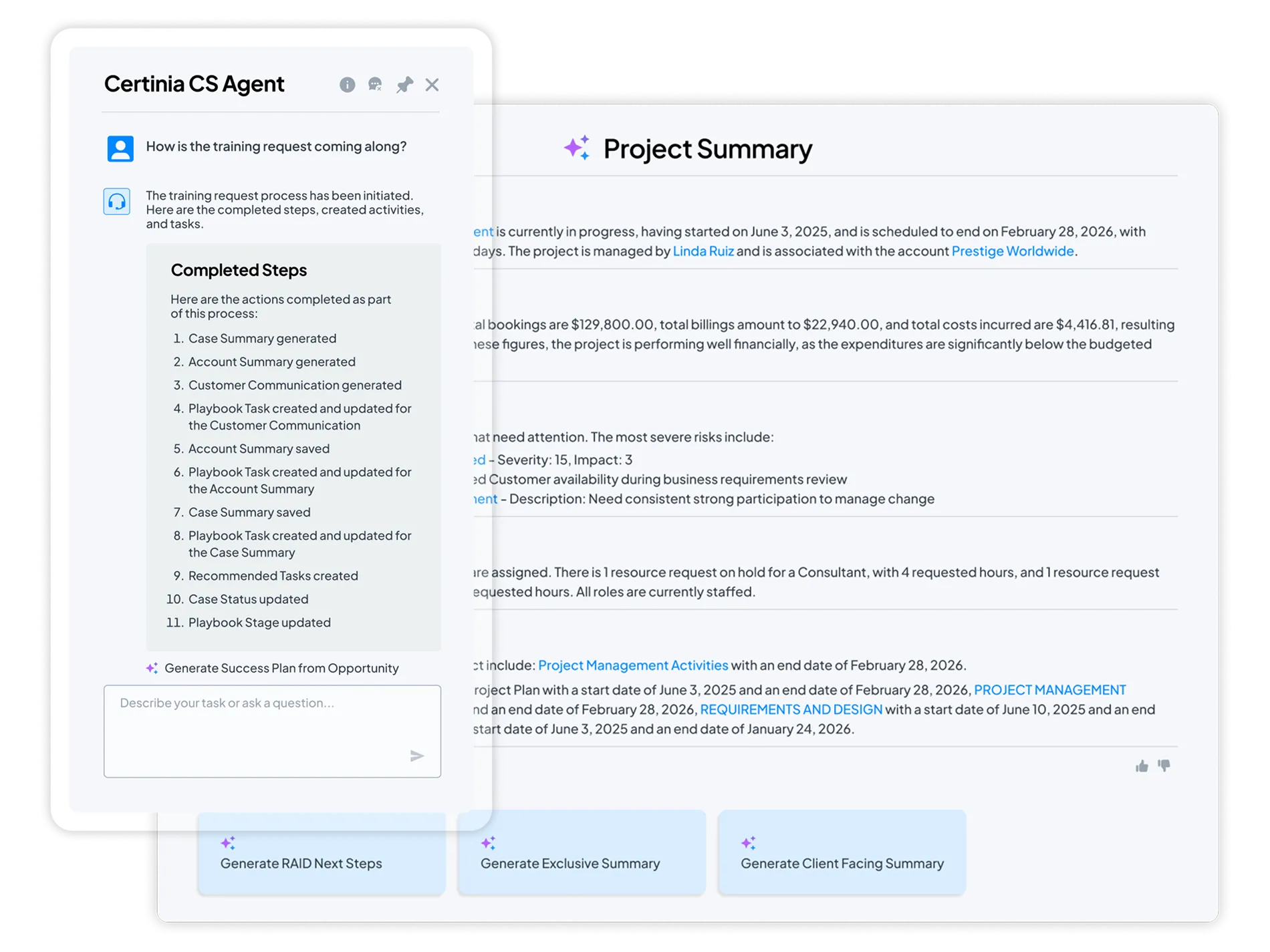
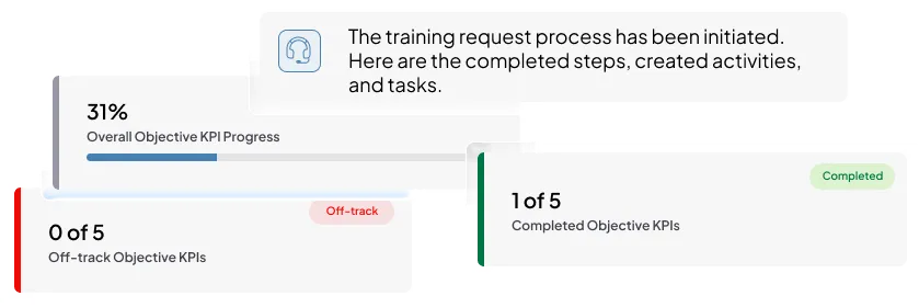
Testimonial Carousel Block
This block displays customer testimonials in a horizontal carousel. Each slide includes a logo, quote, name, and role. Users can navigate between slides using arrow controls. An alternate variation includes a logo-based progress bar below the carousel, allowing users to jump directly to a specific testimonial.
Rotating testimonials with logos and navigation controls

- Monica Engelhardt
- CFO

- Jen Atkins
- Business Strategy & Operations Manager

- Tammy Godin
- Director
- Daniel Menkins
- Salesforce Supply Chain Product Owner

- Tyler Flora
- Senior Director, Professional Services
Rotating testimonials with logos and navigation controls and progress bar

- Matthew Salter
- Professional Services Director

- Naeem Khalid
- Vice President of Customer Success

- Richard Williams
- Finance Director
Recent Articles or Featured Resources


Footer CTA with Static Image
Main call-to-action headline that captures attention
Footer CTA with Multiple Static Images
Static Image + Left-Aligned Content

Static Image + Right-Aligned Content
-
This is a checkbox item.
-
These items are rich text fields so you have more control of text

Embedded Video + Left-Aligned Content
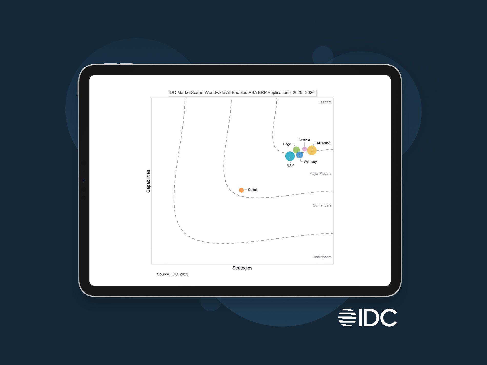
Certinia named a Leader in IDC MarketScape AI-enabled PSA ERP Applications
Discover why uniting financial management and services delivery is so critical to your services business success. With Certinia, you get strengths in:
- Visibility and AI enablement
- Built for the future
- Product road map
Citation: IDC MarketScape: Worldwide AI-Enabled PSA ERP Applications 2025-2026 Vendor Assessment, #US50655323, November 2025
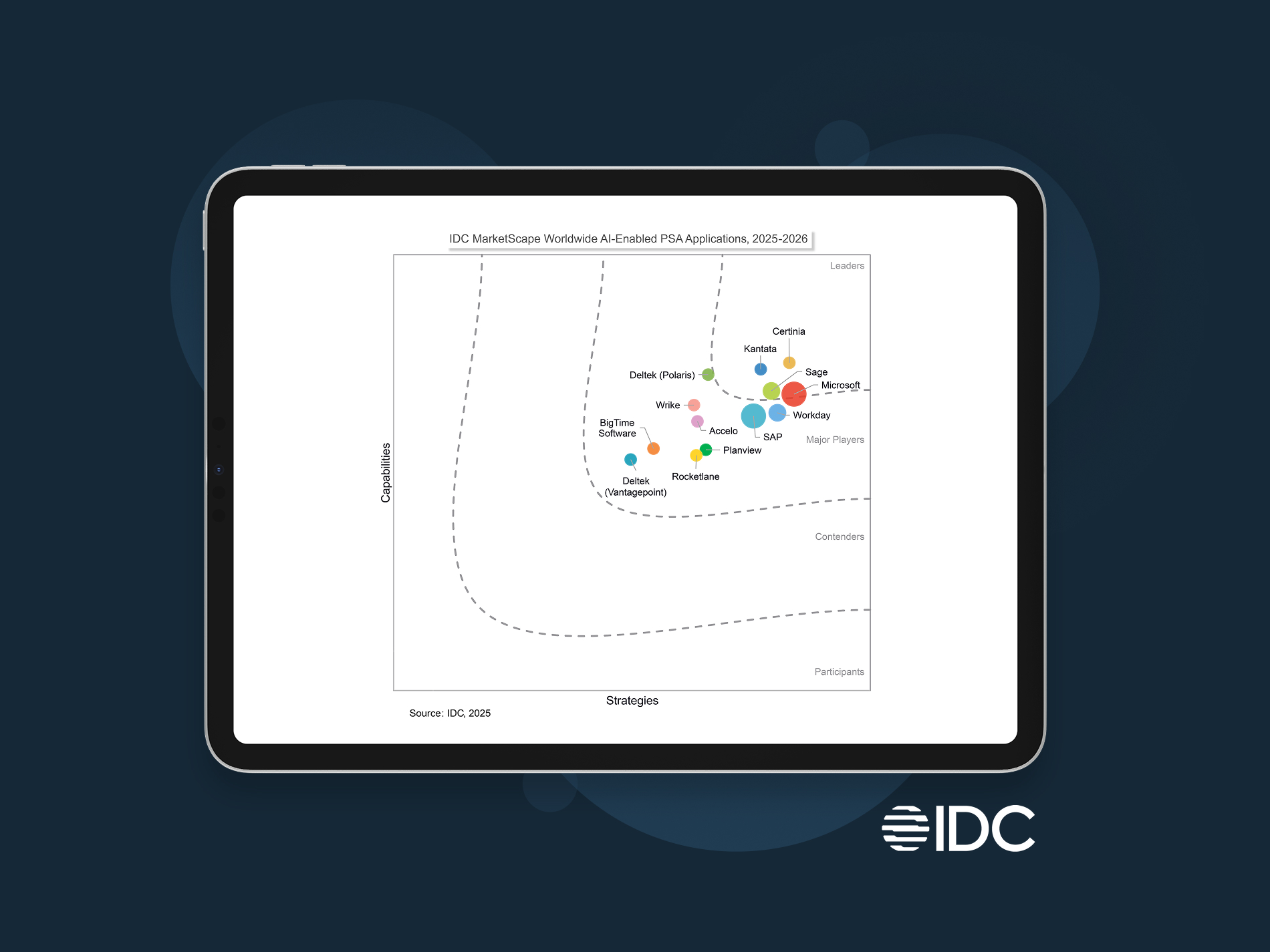
Certinia Named a Leader in IDC MarketScape for Worldwide AI-Enabled PSA
Streamline projects, optimize resources, and boost profit margins. That’s Certinia AI-powered PSA.
- Visibility and AI enablement
- Built for the future
- Product road map
Citation: IDC MarketScape: Worldwide AI-Enabled PSA Applications 2025-2026 Vendor Assessment, #US50655623, December 2025
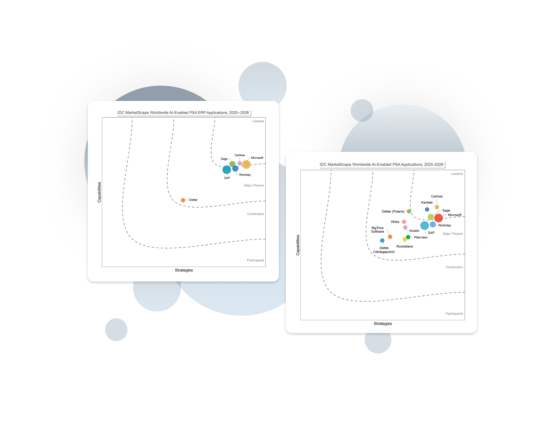
Certinia named a Leader in two IDC MarketScapes for AI-enabled PSA and PSA ERP
Built for the future. Get the actionable AI, working AI Agents, and vast visibility you need to execute with confidence and outpace competition.
Read PSA Excerpt Read PSA + ERP Excerpt
Citation: IDC MarketScape: Worldwide AI-Enabled PSA Applications 2025-2026 Vendor Assessment, #US50655623, December 2025 and IDC MarketScape: Worldwide AI-Enabled PSA ERP Applications 2025-2026 Vendor Assessment, #US50655323, November 2025
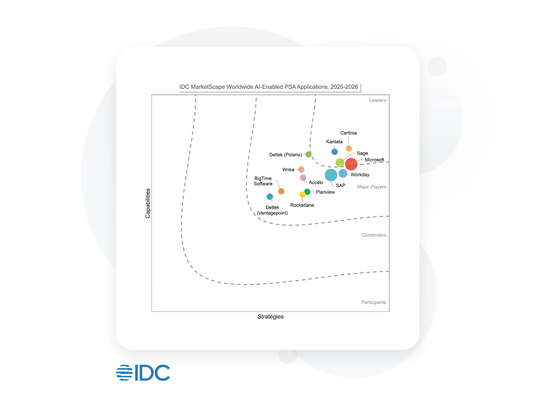
Certinia Named a Leader in IDC MarketScape for Worldwide AI-Enabled PSA
Streamline projects, optimize resources, and boost profit margins. That’s Certinia AI-powered PSA.
 |
Visibility and AI enablement |
|
Built for the future |
|
Product road map |
Citation: IDC MarketScape: Worldwide AI-Enabled PSA Applications 2025-2026 Vendor Assessment, #US50655623, December 2025
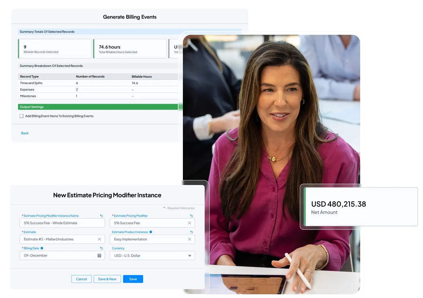
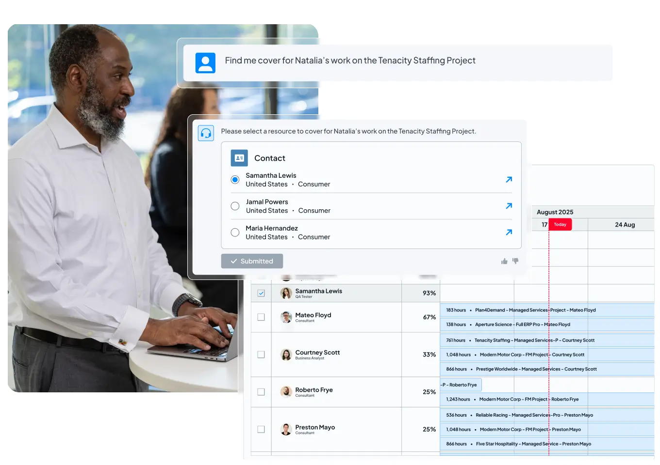
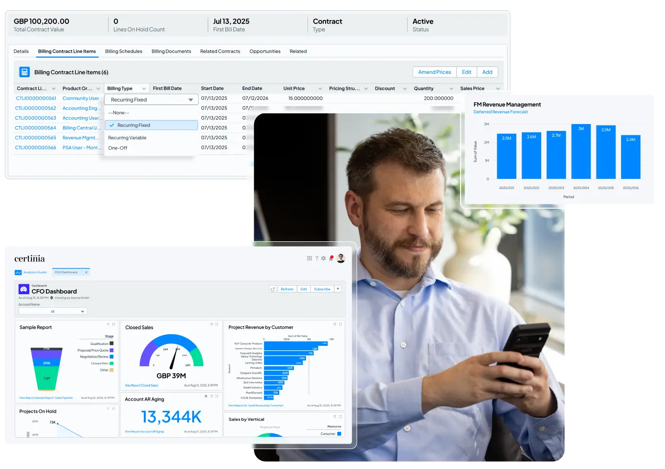
Enterprise AI you can trust
Certinia embeds AI directly into the workflows that run your services business — helping teams plan smarter, act faster, and stay focused on high-value work.
Because Certinia is built natively on Salesforce, the Certinia AI operates on a single, trusted source of data, ensuring every insight is accurate, secure, and actionable.
Meet the new standard for AI-powered services delivery: connected, intelligent, profitable.


See what AI-powered services delivery looks like
What if your teams could plan, deliver, and grow on one intelligent platform?
Schedule a free demo and see how Certinia brings AI and embedded agents into every stage of the services journey—from opportunity to renewal.

100%
Project ROI
99%
Data accuracy every month
>90%
Less revenue leakage
- Tyler Flora
- Senior Director, Professional Services


500
Quotes generated monthly
450
New service delivery projects initiated monthly
~ 7000
Resource requests processed monthly
- Kurt Kuelz
- Senior Vice President, Global Customer Outcomes


100%
Project ROI
99-100%
Data accuracy month-over-month
>90%
Less revenue leakage
- David Laffineuse
- Worldwide Director of Service Delivery


24/7
Real-time project statuses and monthly utilization calculation
10x
Faster project management
100%
Increase in project creation
- Mark Conklin
- Senior Director of Operations

- Christian Gibson
- Director, Global Business Operations

Empowering 1,400+ customers